I recently read Hilary Steward's "Looking At Indian Art of the Northwest Coast" which opened my eyes in how to parse this type of art, and I wanted to share the basics of how to recognize the elegant layout, the musical composition where white space and shape provide balance in an almost Escher-esque repetition of form. Below is a small preview of the basic concepts, quoting from the book:
The two basic colours of the Northwest Coast graphic are are black and red. Black, the primary colour, is mainly used for the form line, a strong contoured line which structures the design and clarifies the anatomy of the subject by defining the head.
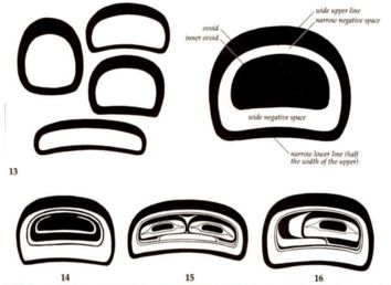
Probably the single most characteristic shape used in this art [Northwest Coast graphic art] is the rounded rectangle: the ovoid.

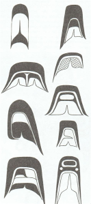
U forms and split-U forms are the secondary most characteristic features, followed by the S form (see below).

In two-dimensional design, large ovoids may be used to delineate the head of a creature or human; they can represent eye sockets or major joins, or help form the shape of a wing, tail, fluke or fin. Like other elements, they may also serve to fill empty spaces and corners.
The shapes fill the space, and anatomy and proportion are adjusted to create a pleasing layout.
The specific design elements refer to a particular creature, or a particular story - just like in European Christian art where a figure with keys must be Peter the apostle, and a lady holding a limp body: the mother of Christ as the 'Pieta', and if one grew up with the folklore and narrative of that culture, the image immediately summons the story.

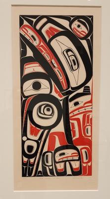
For example, look at this wonderful print from the fantastic exhibition "Guud san Glans - Robert Davidson - A line That Bends But Does Not Break" at the Vancouver Art Gallery, Q1 2023: the creature is re-shaped to fit the rectangle.


Add new comment